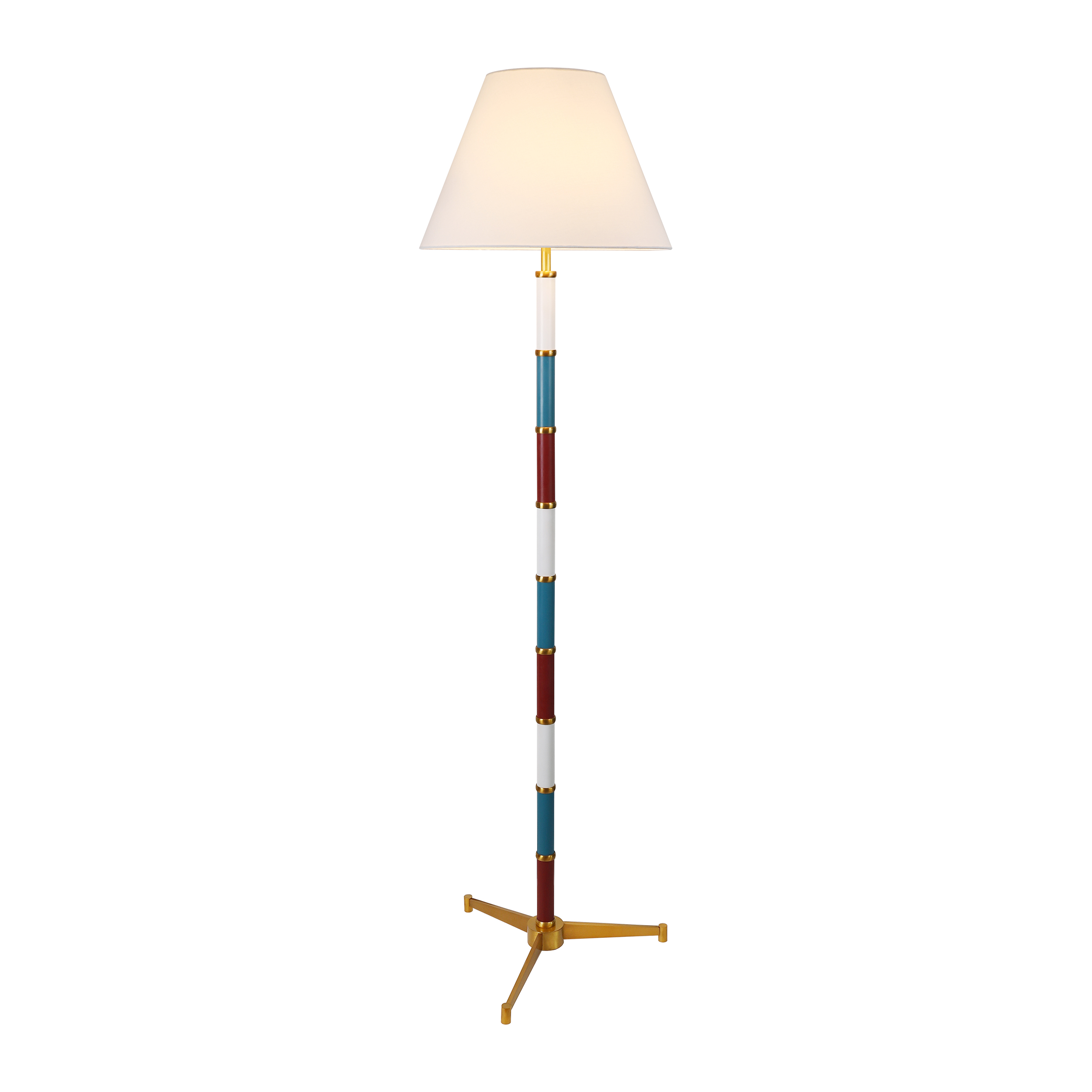
The Ultimate Guide to Lamp Shade Color Coordination: Enhance Your Home Decor
The Ultimate Guide to Lamp Shade Color Coordination: Enhance Your Home Decor
When it comes to Home decor, the right lighting can significantly elevate the ambiance of any room. One of the most crucial elements of lighting design is choosing the perfect lamp shade. This article will explore the art of lamp shade color coordination, giving you tips and insights on how to blend colors effectively to create stunning interiors.
Understanding Lamp Shade Color Coordination
Color coordination is more than just matching; it’s about creating a cohesive look that enhances the overall aesthetic of your space. When selecting a lamp shade, consider the following elements:
| Element | Considerations |
| Room Color Scheme | Identify the primary colors and undertones present in your room. |
| Lighting Type | Consider whether you’re using ambient, task, or accent lighting. |
| Material and Texture | Different fabrics and materials can affect how color is perceived. |
| Functionality | Think about the lamp’s purpose; should it blend in or stand out? |
Choosing the Right Color Palette
When coordinating lamp shade colors, it is essential to select a color palette that complements your existing decor. Here are some strategies to guide you:
1. Use the Color Wheel
The color wheel is a fundamental tool for determining complementary and analogous colors. Complementary colors are opposite each other on the wheel, creating a vibrant contrast, while analogous colors sit next to each other, offering a harmonious blend.

2. Consider the Psychology of Colors
Colors can evoke emotions and set the mood in a room. For instance, warm colors like red and orange create a cozy, inviting atmosphere, while cool colors, such as blue and green, promote a calm and serene environment. Understanding the psychological effects of colors can help you coordinate your lamp shades intelligently.
Popular Lamp Shade Color Combinations
Here are some popular color combinations that can inspire your lamp shade choices:
- Neutral Shades with a Pop of Color: If your room features a neutral palette, a bright lamp shade can serve as a focal point. For example, a golden yellow lamp shade will stand out beautifully against white walls.
- Monochromatic Schemes: Using various shades of the same color can create a refined and sophisticated look. Think of a dark blue lamp shade paired with light blue furniture.
- Earth Tones: Incorporate earthy shades like browns, greens, and terracotta for a warm, inviting feel. A deep forest green shade works well in a space decorated with beige and soft browns.
Textures and Patterns Matter
In addition to color, the texture and pattern of a lamp shade can significantly impact your decor. Consider how different materials interact with light:
1. Fabric Choices
Fabric lamp shades, such as silk or linen, add texture and warmth. Silk casts a softer, diffused light, while linen provides a more rustic feel. When coordinating, keep in mind how the fabric choice complements the surrounding decor.
2. Patterns
If you have solid-colored furniture, patterns can add interest. However, if your space is already busy with patterns, opt for a solid color lamp shade to avoid visual chaos.
Practical Tips for Lamp Shade Selection
Before making a decision, consider these practical tips:
- Test with Samples: When possible, bring home lamp shade samples and test them in your space. Observe how the color changes with different lighting throughout the day.
- Measure Properly: Ensure the size of the lamp shade is proportionate to your lamp and the space. A large shade can overpower a small room, while a tiny shade in a large room may look lost.
- Consider the Lamp Base: The base color and style should also influence your shade decision. A Modern lamp base may pair well with a simple, sleek shade, while a vintage base may call for something more ornate.
Common Questions about Lamp Shade Color Coordination
Here are some frequently asked questions to help clarify your lamp shade color coordination journey:
1. Can I mix different lamp shade colors in one room?
Absolutely! Mixing colors can add depth and character to your space. Just ensure that the colors are in harmony, either through complementary shades or by maintaining a common undertone.
2. How do I choose a color for a lamp shade in a room with bold colors?
In rooms with bold colors, it’s often best to choose a neutral lamp shade to balance out the vividness. Alternatively, opt for a color that picks up on the hues already present to create a cohesive look.
3. What is the trend for lamp shades in interior design?
Current trends include natural materials like rattan and bamboo for a boho vibe, as well as bold, saturated colors for a statement look. The key is to reflect your personal style while ensuring it aligns with your overall decor theme.
Conclusion: Create Your Ideal Lamp Shade Color Coordination
Choosing the right lamp shade color is essential for creating a harmonious and inviting atmosphere in your home. By considering your room’s color scheme, the psychology of colors, and the balance of textures, you can select shades that not only illuminate but also enhance your decor. Remember to test your choices in varying light conditions and don’t hesitate to experiment with different combinations. Your home is your canvas; let your lamp shade be a brushstroke of your personal style!
As you plan your lamp shade color coordination, always keep in mind the following tips:
- Choose colors that reflect your personality.
- Utilize the color wheel for guidance.
- Incorporate various textures to add visual interest.
Happy decorating!
